Choosing the right color scheme is highly important for creating a visually appealing and cohesive business presence. The right color scheme not only adds aesthetic value but also conveys emotions, enhances brand recognition, and influences user behavior. However, with countless color options available, selecting the perfect color scheme is often overwhelming. This is especially true if you have limited design experience.
In this easy guide, together, we will explore the fundamentals of color theory, the different types of color combinations, the psychology of colors, and the best tools to choose the ideal color palette for you. By the end of this article, you’ll be equipped with the knowledge and resources to make informed decisions about your color scheme.
Understanding Color Theory: The Basics
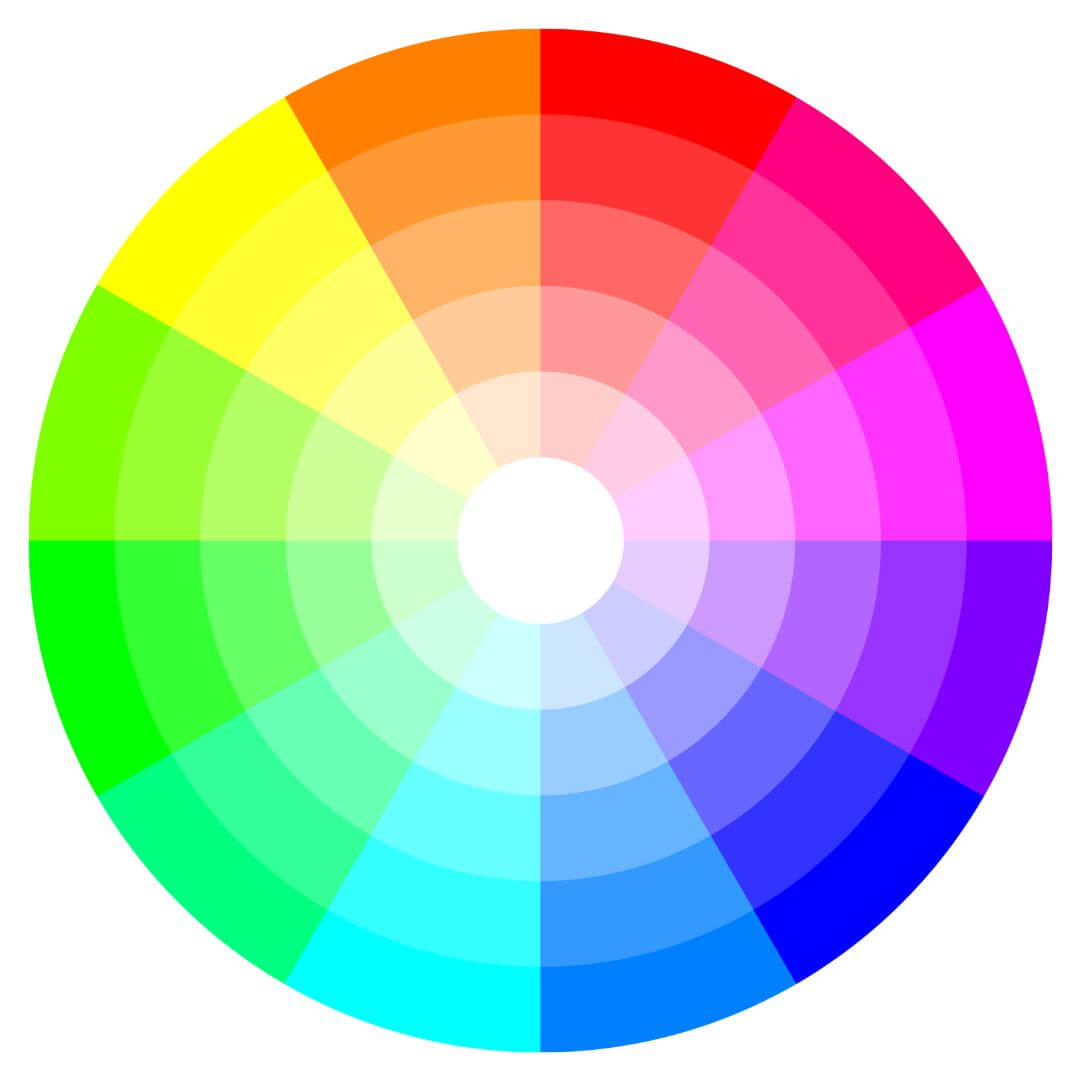
Before delving into color combinations, it’s essential to grasp the basics of color theory. The color wheel serves as a foundational tool for understanding how colors relate to one another. All colors are derived from three primary colors: red, blue, and yellow. By mixing these primary colors in different quantities, we can create a vast array of secondary and tertiary colors.
Primary colors: Red, blue, yellow
Secondary colors: Orange, purple, green
Tertiary colors: Blue-green, red-orange, yellow-green
These colors form the basis of the color wheel, which illustrates their relationships. By referring to the color wheel, you can easily identify which colors complement each other and create harmonious combinations.
Exploring Different Types of Color Combinations
When choosing a color scheme, it’s helpful to understand the various types of color combinations and how they work together. Here are the four main types of color combinations:
1. Complementary Colors
Complementary colors are hues that sit directly opposite each other on the color wheel. The contrast between these colors creates a vibrant and visually appealing combination. One color usually serves as the main color, while the other acts as an accent.
For example, blue and orange are complementary colors. The bold contrast between these shades can create a striking effect on your website.
2. Triadic Colors
Triadic color schemes involve selecting three colors that are evenly spaced around the color wheel, forming a triangle. This combination offers a balance between contrast and harmony.
For instance, you can choose red, yellow, and blue as your triadic colors. Together, these colors create a lively and dynamic palette.
3. Analogous Colors
Analogous color schemes consist of colors that are adjacent to each other on the color wheel. These colors are similar in tone and create a sense of harmony and unity.
For example, green, yellow-green, and yellow form an analogous color scheme. This combination is soothing and often associated with nature.
4. Triadic Colors
Triadic color schemes involve selecting three colors that are evenly spaced on the color wheel, forming a triangle. This combination provides a high level of contrast and allows for more creative flexibility.
To create a triadic color scheme, choose one primary color and pair it with two complementary colors. For instance, you can select red as the primary color and pair it with green and blue-purple.
Remember that these color combinations serve only as a starting point. It’s your job to adjust and modify them to fit your brand’s identity and message.
• BONUS: Color wheel downloadable!
Free downloadable PDF: Types of Color Schemes – use the down arrow over the file icon to download your PDF.
Download PDF size: 746 x 1269 pxs
Powered By EmbedPress
The Psychology of Colors: How Colors Influence Emotions
Colors have a profound impact on our emotions and can evoke specific emotions. Understanding the psychology behind colors helps you choose hues that align with your brand. It also affects effective communication of your message. Here’s a breakdown of the emotional associations commonly associated with different colors:
• Blue
Blue is often associated with feelings of calmness, trust, and professionalism. It’s a popular choice for corporate websites and brands that want to convey reliability and stability.
• Red
Red is a vibrant and energetic color that symbolizes passion, excitement, and urgency. It can create a sense of urgency and encourage action, making it suitable for brands in the food and retail industries.
• Yellow
Yellow is a cheerful and optimistic color that evokes feelings of happiness and positivity. It’s often used to grab attention and can be an excellent choice for brands that want to convey warmth and friendliness.
• Green
Green represents nature, growth, and harmony. It’s associated with feelings of freshness and relaxation. Brands that focus on sustainability, health, or the environment often incorporate shades of green into their color schemes.
• Purple
Purple is often associated with luxury, creativity, and spirituality. It can create a sense of elegance and sophistication, making it a popular choice for brands in the beauty and fashion industries.
• Pink
Pink is a color often associated with femininity, compassion, and playfulness. It can evoke feelings of sweetness and gentleness and is commonly used in industries such as cosmetics and children’s products.
• Orange
Orange is a vibrant and energetic color that represents enthusiasm, creativity, and excitement. It can create a sense of warmth and can be an effective choice for brands that want to stand out and exude positivity.
By considering the emotional associations of different colors, you can strategically incorporate them into your website design to elicit specific reactions from your audience.
• Color psychology chart to help you fine-tune your color scheme
There are many different color psychology charts available that explain what each color represents. Here is a brief overview of some of the most common colors and their meanings:
| Red | Sincerity, energy, love, speed, power, heat, all things intense and passionate. |
| Pink | Love and romance, caring, tenderness, acceptance, and calm. |
| Ivory | Benevolence, unification, peace, and quiet. |
| Yellow | Signifies joy, happiness, optimism, idealism, imagination, hope, sunshine, summer, philosophy, and friendship. |
| Dark Blue | Integrity, deep thinking, knowledge, power, and seriousness. |
| Blue | Peace, calm, harmony, unity, trust, truth, confidence, cleanliness, sky, water, and appetite suppressant. |
| Turquoise | Calm. Teal symbolizes sophistication. Aquamarine symbolizes water. Lighter turquoise has a feminine appeal. |
| Purple | Royalty, spirituality, mystery, transformation, wisdom, enlightenment. |
| Lavender | Femininity, grace, peace, and elegance. |
| Orange: | Energy, balance, enthusiasm, warmth, vibrant, and flamboyant. |
| Green: | Nature, health, good luck, renewal, spring, generosity, fertility, and vitality. |
| Brown: | Earth, reliability, endurance, simplicity, comfort, and sincerity. |
| Gray: | Reliability, intelligence, modesty, dignity, practicality, and calmness. |
| White: | Reverence, purity, birth, simplicity, precision, innocence, youth, winter, snow, and in some cultures, marriage. |
| Black | Power, sophistication, formality, elegance, wealth, mystery, and mourning. |
Tip o’ the hat to Incredible Art
Useful Color Palette Generators: Tools for Choosing the Perfect Color Scheme for You
Next, it’s time to explore some useful tools that assist you in choosing the perfect color scheme. These color palette generators offer a wide range of color inspiration. They also make the selection process easier and more efficient. Here are some top-rated color palette generators:
1. Coolers
Coolers is a user-friendly color palette generator that allows you to explore various color combinations. Select from pre-generated palettes or create your own by adjusting the colors manually. It provides the HEX codes for each color in the palette. Doing so makes it easy to implement them in your design.
2. Color Hunt
Color Hunt is a curated collection of beautiful color palettes created by worldwide designers. The website offers a wide range of color combinations. Plus, you can filter the palettes by popularity and color category. Each palette comes with HEX codes for easy integration into your design.
3. Muzli Colors
Muzli Colors is a color palette generator that provides inspiration from various sources, including popular design platforms and color trends. The tool offers a wide selection of color schemes. It allows you to save your favorite palettes for future reference. Muzli Colors also provides HEX codes and allows you to download the palettes as a PDF or PNG file. Nice!
4. Adobe Color
Adobe Color is a powerful color palette generator that offers a range of options for creating color schemes. Choose from different color harmonies, such as complementary, triadic, and analogous. Adobe Color also provides access to color libraries and trends for more inspiration.
5. Color Space
Color Space is a versatile color palette generator that allows you to explore various color combinations and adjust them to your liking. The tool offers a wide selection of color palettes, and you can copy the HEX codes for each color. Color Space also provides additional features, such as color blindness simulation and contrast checking.
6. Canva Pro
Looking for a color scheme that complements your favorite pictures? Canva’s color palette generator allows you to effortlessly create color combinations in just seconds. All you have to do is upload a photo, and it will use the colors in the image to generate your unique palette.
Using these color palette generators allows you to explore different color combinations, find inspiration, and create a cohesive and visually appealing color scheme.
Applying Your Color Scheme: Tips for Implementation
Once you chose the perfect color scheme, you must implement it for a cohesive user experience. Here are some tips for implementing your color scheme:
1. Use Colors to Create Hierarchy
Consider using different colors to create visual layering. Assign primary colors to important elements such as headers, call-to-action buttons, and key information. Also, use accent colors sparingly to draw attention to secondary elements or add visual interest.
2. Ensure Accessibility
When choosing colors, also consider accessibility. For example, the color contrast between text and background must readable for all users. However, this must also include those with visual impairments.
3. Test Across Devices
Next, test how it appears on different electronic devices and screen sizes. Of course, colors may appear differently on various screens. So, this is an important point to keep in mind.
4. Monitor User Response
Of course, it’s a good business tactic to monitor your audience’s response to your color scheme. Therefore, pay attention to user engagement, conversions, and other key performance indicators. This will help you assess the impact of your color scheme on user experience and brand perception.
5. Additional Points to Remember
- When selecting your color scheme, consider the emotional associations of colors. Also, consider how they align with your brand’s message and target audience.
- Experiment with different color combinations and shades to find the perfect balance that reflects your brand’s identity and values.
- Don’t be afraid to think outside the box. Try unique color combinations that stand out from competitors but stay true to your brand.
- Regularly monitor user response to your color scheme. Ensure that it effectively communicates your brand and enhances the overall user experience.
By following these implementation tips, it ensures that your color scheme enhances your user’s experience effectively.
Conclusion
Choosing the perfect color scheme for your website is important for a visually appealing and cohesive online presence. Additionally, be aware of the color theory, different types of color combinations, and the psychology of colors.
Using color palette generators streamline the process and provide a range of color inspiration. By implementing your chosen color scheme effectively, considering accessibility and user response, you create the perfect color scheme.
Remember, the colors you choose must align with your brand’s identity and message. They must also create an aesthetically pleasing and user-friendly experience. By carefully selecting your color scheme, your color scheme on your audience leaves a lasting impression.
Now you have the knowledge and resources to choose the perfect color scheme. So, get creative and start designing a visually stunning presence that truly represents your brand.
To My Readers
I strive to write content in a tone that is approachable, informative, and reflective, aiming to shed light on complex concepts by breaking them down into simpler terms. I also strive to foster understanding and encourage self-improvement while maintaining a balance between professionalism and personal well-being. If you have any suggestions or require additional information, I’d very much like to hear from you in the comments below. Thank you for reading!

