
As a professional, I am aware of how important it is to know how to create outstanding presentations that are both visually appealing and informative. I believe most of us are aware that it’s almost impossible to get through a business meeting without the use of a professional presentation.
Whether it’s for a presentation to investors or a marketing proposal to clients, a memorable design for your PowerPoint increases your chances of landing investment opportunities or succeeding with your project. In this article, I discuss the following nine tactics for a great presentation, every time!
1. Designing Outstanding presentations for project pitches
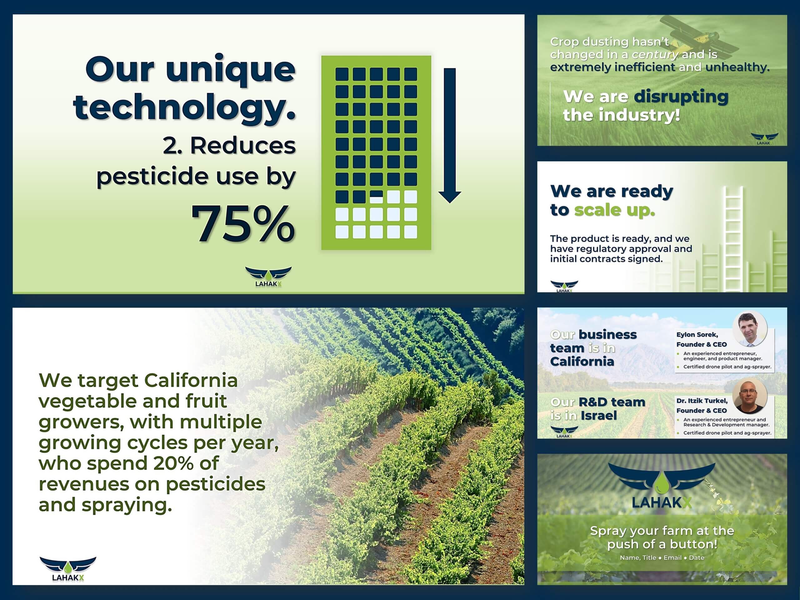
Presenting your project to investors is such an exciting opportunity! What’s more, putting in the effort to create a professional PowerPoint presentation is of paramount importance because you must make a lasting impression on your potential investors.
For outstanding presentations that leave lasting impressions, you must convey your message in a clear and concise manner. This is highly important because investors must understand the value and potential of your project. So, don’t underestimate the power of a well-designed presentation. In fact, it is the key to securing the support and funding you need for your project’s success.
If you’d like to know what some of the experts have to say about pitches, I invite you to tap on the banner below and look through the information. It’s an interactive list, so please feel free to add your own resources for designing amazing and winning pitch decks.

2. Avoid these common mistakes for outstanding presentations
One of the most common mistakes designers make is using too much text. First, science tells us that the human brain reads faster than you speak. Therefore, you lose your audience with too much content. So, you must strive to use the right visuals and less text to support your message and keep your audience’s attention. Of course, it’s a balancing act, but well worth the effort.
Another common mistake is using low-quality graphics and images. The result is an unprofessional and amateurish impression. In addition to high-res images and graphics, using images that are relevant to your message increase the impact of your message. Using relevant images often involves a great deal of research into the company that is using your design services.

Additionally, aligning every slide perfectly – left, right, top, and bottom – adds to ease of viewing and comprehending your message. When things are out of alignment, people’s eyes will instantly, look away. In any case, it’s at least a sub-conscious irritant to your audience. So, please remember to be as precise as possible by using guides on every slide to ensure perfect alignment throughout your design.
3. Tailor your PowerPoint presentation to your audience
First, you must first understand your audience and then, tailor your presentation to them. This is an exciting opportunity to connect with your clients to leave a lasting impression on their audience. By taking the time to research and analyze the client’s audience, you tailor the presentation to their specific interests and concerns. This personal approach not only demonstrates your professionalism but also ensures delivery of content that resonates with them. So, before stepping onto that stage, ask yourself,
“Who is the audience, and what do they care about?”
This involves a deep dive into your client’s industry, company, and roles within the organization. For example, if you’re presenting to a group of marketing executives, focus on the latest trends and strategies in upscale digital marketing. By aligning your content with their interests, you’re more likely to engage their audience to boldly hold attention throughout the presentation.
You also want to anticipate the questions an audience might ask. So, practice empathy by putting yourself in their shoes and think about the information they want from your presentation. Doing so enables you to not only design to your client’s expectations but it also prepares thorough and well-thought-out answers for your client. A great technique is adding these questions and answers to the presenter notes in PowerPoint. The excellent result of this is that your client establishes trust and credibility, making the audience more receptive.
“What questions might the audience ask and how will your client answer them?”
Resources to identify your target audience
- Planning Your Presentation Around Your Target Audience: This article provides a comprehensive guide to help you understand your audience’s needs and preferences, and how to tailor your presentation accordingly.
- Audience Analysis for Presentations: How to know your audience and …: This article provides a detailed guide on how to analyze your audience’s demographics, interests, and behavior, and how to use this information to create an effective presentation.
- Target Audience: How to Find Yours [+ 5 Campaign Examples]: This article provides a step-by-step guide on how to identify your target audience using various methods such as surveys, social media analytics, and customer interviews.
I hope these resources help you identify your client’s target audience effectively! Not surprisingly, your enthusiasm and passion for the topic shines through when content delivery includes information that is relevant to their lives and careers. Remember, the goal is not just to educate but also to inspire and motivate. By understanding the audience’s interests and concerns, you can do just that.
5. Refine and improve the design of your PowerPoint presentation
To create a professional PowerPoint presentation, it’s additionally important to refine and improve it. Start by reviewing your slides and removing any unnecessary text or graphics. Next, focus on improving the quality of your graphics and images, using high-quality visuals that enhance – not detract from – your message. Finally, request that your client practice your presentation to ensure that it flows smoothly and that they are comfortable with the material. See more about this below in item 8.
Again, the most common mistake in presentation design is overcrowding slides with excessive text or graphics. Your goal is to strike the perfect balance in which each element serves an exact purpose and enhances the overall visual appeal. By simplifying your slides and leaving enough white space, you create a sense of clarity which allows your audience to absorb the information more effectively. Remember, less is more when it comes to presentation design. You can also prepare presenter notes for your client for more content to use when they present.
“Remember, less is more when it comes to outstanding presentations design.”
6. Replace basic graphics with professional visuals
Replacing grainy or non-representative graphics with professional visuals make a big difference in the quality of your outstanding presentations. Use high-quality images and graphics that are relevant to your message. Also, always avoid using clip art and low-quality images, as these make your presentation look unprofessional.

There are many Software as a Service venues from which you can get awesome, professional, hi-res images at a reasonable cost. One such service is Canva Pro which is used by thousands of businesses worldwide. One of their unique features is they derive their images from many other high-quality sites. I also use Adobe images which is sometimes a higher level of images, but I’ve even found many Adobe Images on Canva Pro. As a result, I always look to Canva Pro first – then I go to Adobe Images. It saves me time and money.
“Consistently use only carefully selected high-resolution images in all your designs.”
7. Design a cohesive and visually appealing presentation
The moment you step into the world of presentation design, you embark on a journey of creativity and innovation. Imagine the thrill of selecting the perfect color scheme and font that not only captivates an audience but also leaves a lasting impression. Remember, with each slide, you’re developing a visual story whose purpose it is to engage, inspire, and persuade.
One secret ingredient to a successful presentation lies in the color scheme and font that you choose. This is what ties everything together and creates a sense of unity throughout your slides. So, imagine a presentation where each slide is a burst of vibrant colors, paired with an elegant font that complements your message. In fact, the cohesiveness of your slides not only showcases your professionalism but also makes it easier for your audience to navigate through your content seamlessly. As a result, they focus on the message without any distractions or inconsistencies.
“If you client doesn’t have a color scheme or preference for fonts, be prepared to show them a selection before the design begins.”
But a visually appealing presentation is not just about colors and fonts; it’s also about the strategic use of images and graphics. In fact, each image or graphic must contribute to the overall message. Whether it’s a powerful photograph that evokes emotions or an informative infographic that simplifies complex data, every visual element has a distinct purpose. Then, by carefully selecting and placing these visuals, you enhance the impact of a memorable message.
8. Add engaging information to your presentation
The addition of engaging and informative content to your presentation is perfect for audience engagement. Use stories and examples to illustrate points therefore making outstanding presentations that are relatable. Also, remember to use statistics and data to support the message to make it even more informative.
Gone are the days of boring slides filled with endless bullet points and text-heavy information. Today, audiences crave interactive presentations that capture their attention from start to finish. By incorporating stories and examples, points are brought to life and are more relatable to the audience. By sharing personal anecdotes or real-life case studies, it establishes a connection with the listeners on a deeper level thereby increasing the level of comprehension.
“Avoid text heavy or bulleted content. Rather, design emphasis while using space as a design element and use only relevant encapsulated information with informational and attractive charts and high-resolution images.”
But it’s not just about the stories and examples. In order to truly make your presentation informative, you must also present statistics and data. In fact, numbers have a way of adding credibility and weight to your message. By including relevant statistics, research findings, or survey results, this gives evidence to support your claims. This not only makes your presentation more persuasive but also makes the relevance of the topic understandable.
Imagine this: you’re designing a presentation on the benefits of regular exercise. Instead of simply saying that exercise is good for overall health, share a story about someone who transformed their life through regular physical activity. By describing their journey from a sedentary lifestyle to an active one, you naturally evoke emotions and inspire the audience to take action. Then, to further reinforce the importance of exercise, include statistics on the impact of physical activity on reducing the risk of chronic diseases such as heart disease and diabetes. This combination of storytelling and data-driven information not only engages your audience but also educates them on the benefits of leading a healthy lifestyle.
9. Recommend that your client practice the presentation
Rehearsing outstanding presentations is key to delivering a successful project pitch. Techniques include practicing the presentation in front of a mirror or with co-workers or friends to get feedback on the delivery and content. Then, keep rehearsing until the material is comfortable enough to deliver it smoothly.
Using the presenter notes feature in PowerPoint gives your client even more options. For one thing, they can speak from your presenter notes during the presentation. For another, they can print out the presenter notes and distribute them after the meeting as a reinforcing handout. Don’t recommend that they hand them out before the meeting because the audience will simply read along and again, they read much faster than the speaker so they lose their audience.
“If you fail to plan, you plan to fail.”
Benjamin Franklin
Resources for outstanding presentations design
If you need assistance with creating a professional PowerPoint presentation, there are many resources available. Consider hiring a PowerPoint designer or expert to help you create a presentation that is both informative and visually appealing. There are, of course, lots of online resources and tutorials to help you improve your PowerPoint skills.
I invite you to view my PowerPoint and Canva presentation portfolio. I also design with Google Slides and the Windows version of Keynote. In fact, not surprisingly, it’s easy for any PowerPoint expert to switch to the other two because it’s naturally in the interest of both Google and Apple to make their software compatible with the industry standard which is PowerPoint.
Conclusion
It’s easy to understand why a professional PowerPoint presentation is key to the success of a project pitch. By avoiding common mistakes, understanding and tailoring the outstanding presentations to the audiences, you design a product that is both informative and engaging. By refining and improving, using high-quality graphics and visuals, you deliver a outstanding presentations to your clients that are sure to impress. I wish you the best of success in all your endeavors.
If you need assistance with creating a professional PowerPoint presentation, consider hiring me to help you create a presentation that is both informative and visually appealing. Let’s schedule a free consultation today to get your project started!